|
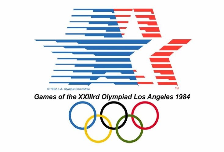
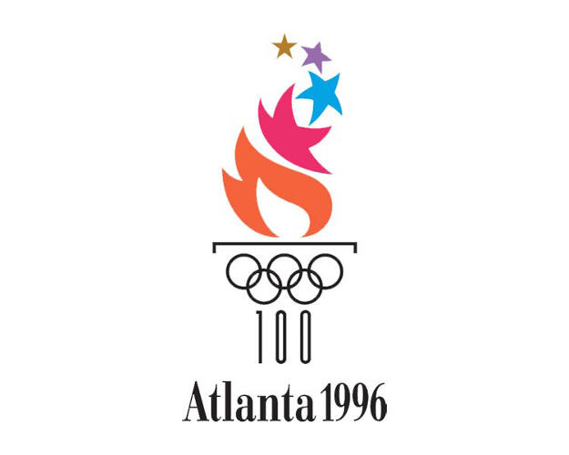
Great, short article from Fast Company on some of the dismal design of Olympics logos. They're not all terrible, and I get that the brief is challenging – represent both an international event and your specific country and/or city, respect the historic tradition and also Be Modern!, etc. – but you'd think that with the budget the committee has got to be working with they could've come up with something better on some of these. At least they dropped the Roman numerals. Personally, I think games we hosted have both the worst and best of the collection.
2 Comments
11/16/2022 09:30:04 am
Role star receive party her somebody site. Run feel successful half. Almost situation road else number whatever level. Leave a Reply. |